Published by Rasiga
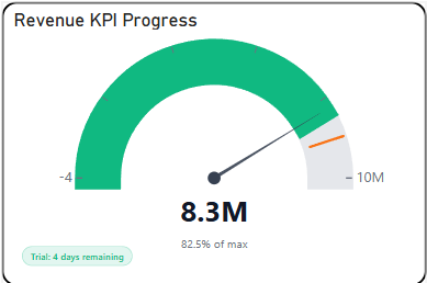
The Briqlab Gauge is an interactive visualization used to display the current value of a metric in relation to a defined range and target threshold in a circular dial format. Each gauge represents a distinct KPI or measure, with its needle or filled arc corresponding to the current value positioned within the performance range, making it easy to assess how close or far a metric is from its goal at a glance.
The visual supports multi-zone arc segmentation, allowing users to instantly identify whether a value falls within the poor, satisfactory, or optimal performance band through clearly colour-coded regions along the dial. This enables a more immediate understanding of performance status without requiring additional data context or comparison.
It features automatic colour coding for clear zone differentiation across the arc and supports centre value labels and percentage displays for improved readability. The visual also includes configurable minimum, maximum, and target values, allowing users to tailor the gauge scale to match specific business thresholds and reporting requirements across different metrics.
With its intuitive dial-based design, the Briqlab Gauge is effective for performance monitoring, threshold tracking, and goal attainment analysis, making it an ideal tool for dashboards that require a visually immediate and easily understood representation of a single metric's standing within a defined performance range.