Download free Power BI custom visuals (.pbiviz) — gauges, KPI cards, charts, and more.
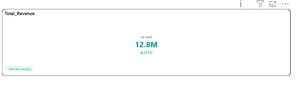
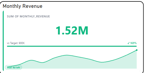
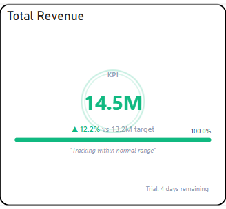
Briqlab KPI Card is an interactive visualization designed to present key performance indicators in a clear and focused format, enabling users to monitor critical metrics, trends, and performance changes at a glance. The visual highlights primary values alongside contextual indicators such as growth percentages, variance, and directional trends to support quick decision-making. It supports compact KPI representation with configurable layouts, conditional formatting, trend indicators, and category labels, allowing users to emphasize performance movements and track progress against goals or prior periods. Interactive tooltips and formatting options provide additional flexibility for presenting both summary-level metrics and supporting context. With its clean and executive-friendly design, Briqlab KPI Card is ideal for dashboard scorecards, performance monitoring, revenue tracking, target achievement analysis, and business reports that require prominent and intuitive display of key metrics.
briqlab-kpi-card
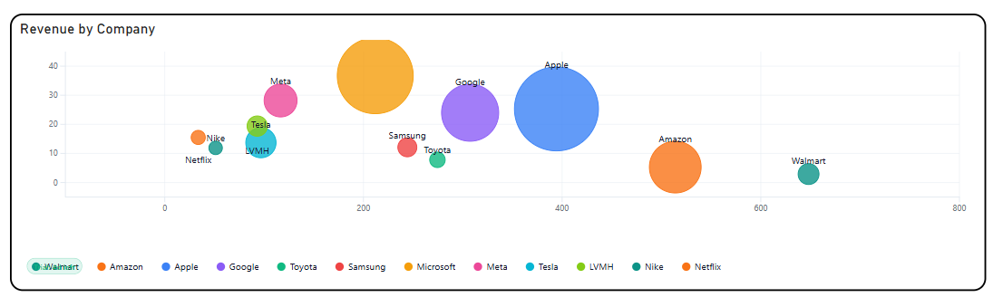
Briqlab Drill Bubble is an interactive bubble chart visualization designed to analyze relationships across multiple measures by plotting data points using position and bubble size in a single view. It enables users to compare categories across dimensions such as volume, performance, and magnitude while simultaneously revealing patterns, correlations, and outliers. The visual supports multi-dimensional analysis by representing measures through X and Y axes, while bubble size encodes an additional quantitative value, allowing users to interpret three variables at once. Color-coded categories improve differentiation, while interactive tooltips and highlighting provide deeper insight into individual data points and their comparative contribution. With configurable axes, bubble scaling, category grouping, and drill capabilities, Briqlab Drill Bubble is ideal for performance analysis, market comparisons, correlation analysis, portfolio evaluation, and dashboards that require an engaging visual for exploring complex relationships within data.
briqlab-drill-bubble
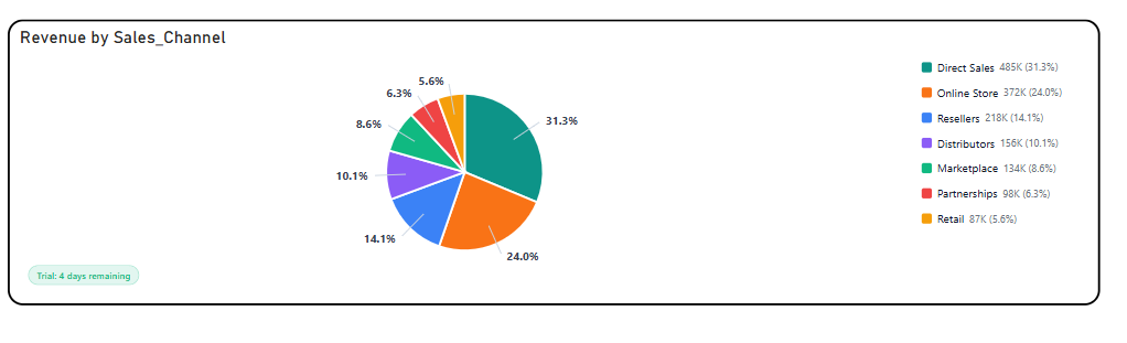
Briqlab Pie Chart is an interactive visualization designed to represent part-to-whole relationships by displaying the proportional contribution of categories within a dataset through segmented slices. Each slice is sized according to its value and color-coded for clear category differentiation, enabling users to quickly compare shares, identify dominant contributors, and analyze distribution patterns at a glance. The visual supports intuitive proportional analysis with configurable labels, legends, and percentage/value display options, making it easy to interpret both relative and absolute contributions. Interactive tooltips and category highlighting allow users to explore detailed values and gain deeper insight into category composition. With its clean and engaging design, Briqlab Pie Chart is ideal for revenue distribution, market share analysis, composition breakdowns, category comparisons, and dashboards requiring a simple yet effective view of how individual segments contribute to the whole.
briqlab-pie-chart
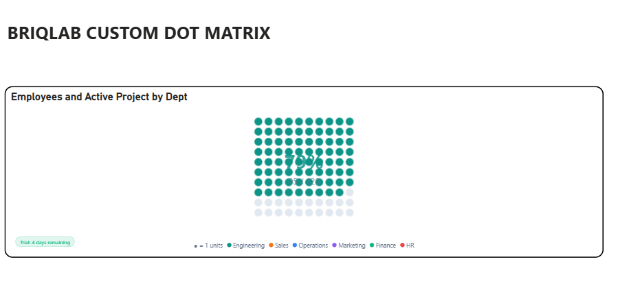
Briqlab Dot Matrix is an interactive visualization designed to represent proportional distribution across categories using a structured grid of uniform dots, where each dot represents a fixed unit of value. Through color-coded category grouping, users can quickly compare the relative share and contribution of each category within the total dataset. The visual uses grid-based proportional encoding to provide an intuitive, countable representation of part-to-whole relationships, offering a compelling alternative to traditional percentage-based charts. Dot density and arrangement help users instantly perceive category dominance, distribution patterns, and comparative volumes. It supports configurable dot sizes, grid layouts, automatic category color assignment, interactive tooltips, and category highlighting for deeper exploration of values and contributions. Briqlab Dot Matrix is ideal for proportional analysis, category comparison, progress tracking, unit-based storytelling, and dashboards that require a clear and engaging representation of how individual categories contribute to the whole.
briqlab-dot-matrix
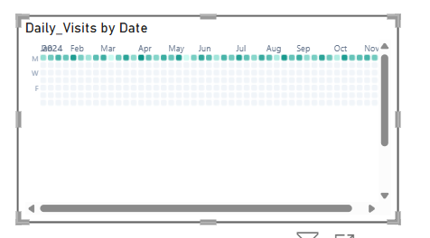
The Briqlab Calendar Heat Map is an interactive visualization used to display the distribution and intensity of data values across a calendar-based time period. Each cell represents a distinct day, week, or month, with its colour intensity corresponding to the magnitude of the value recorded during that period, making it easy to identify patterns, peaks, and low-activity periods across time at a glance. The visual supports continuous colour gradient encoding, allowing users to instantly distinguish between high, moderate, and low value periods through a spectrum of shades ranging from light to dark. This enables a more intuitive understanding of temporal patterns, seasonal trends, and recurring cycles within the dataset. It features automatic colour scaling for clear intensity differentiation across all calendar cells and supports configurable date ranges and period groupings for improved readability and contextual relevance. The visual also includes interactive tooltips and cell highlighting, allowing users to hover over individual dates to explore precise values and compare activity levels across different time periods. With its time-based and pattern-driven design, the Briqlab Calendar Heat Map is effective for tracking daily performance, identifying seasonal trends, monitoring activity cycles, and visualizing time-series data, making it an ideal tool for dashboards that require a comprehensive and calendar-aligned view of value distribution over time.
briqlab-calendar-heat
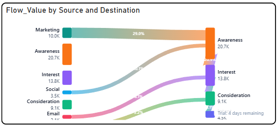
The Briqlab Flow Sankey is an interactive visualization used to display the flow and distribution of values between interconnected nodes across multiple stages or categories. Each node represents a distinct entity or category, with the width of the connecting flows corresponding to the volume or magnitude of the relationship between them, making it easy to trace how values move, split, or converge across different stages at a glance. The chart supports multi-level flow rendering, allowing users to follow the journey of values from source nodes through intermediate stages to destination nodes simultaneously. This enables a more comprehensive understanding of how resources, quantities, or proportions are distributed and redistributed across the entire flow network. It features automatic colour assignment for clear node and flow differentiation and supports interactive hover highlights that illuminate individual flow paths for improved traceability and readability. The visual also includes labelled nodes with value annotations, allowing users to easily quantify the contribution and receiving volume of each node within the overall flow structure. With its dynamic and flow-driven design, the Briqlab Flow Sankey is effective for analysing resource allocation, budget distribution, customer journey mapping, and process flow breakdowns, making it an ideal tool for datasets that require a clear and detailed representation of how values transition and distribute across multiple interconnected stages.
briqlab-flow-sankey
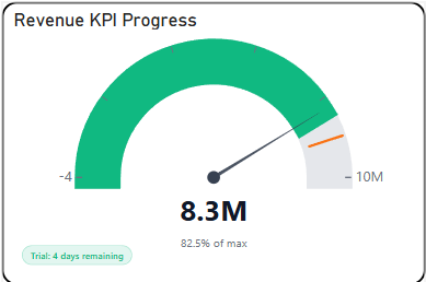
The Briqlab Gauge is an interactive visualization used to display the current value of a metric in relation to a defined range and target threshold in a circular dial format. Each gauge represents a distinct KPI or measure, with its needle or filled arc corresponding to the current value positioned within the performance range, making it easy to assess how close or far a metric is from its goal at a glance. The visual supports multi-zone arc segmentation, allowing users to instantly identify whether a value falls within the poor, satisfactory, or optimal performance band through clearly colour-coded regions along the dial. This enables a more immediate understanding of performance status without requiring additional data context or comparison. It features automatic colour coding for clear zone differentiation across the arc and supports centre value labels and percentage displays for improved readability. The visual also includes configurable minimum, maximum, and target values, allowing users to tailor the gauge scale to match specific business thresholds and reporting requirements across different metrics. With its intuitive dial-based design, the Briqlab Gauge is effective for performance monitoring, threshold tracking, and goal attainment analysis, making it an ideal tool for dashboards that require a visually immediate and easily understood representation of a single metric's standing within a defined performance range.
briqlab-guage
The Briqlab KPI Sparkline is an interactive visualization used to display the current value of a key performance indicator alongside a compact trend line showing its historical movement over time. Each KPI card represents a distinct metric, with its sparkline corresponding to the fluctuation and direction of values across a defined period, making it easy to monitor both the current status and recent trend of critical business measures at a glance. The visual supports inline trend rendering, allowing users to instantly identify whether a KPI is trending upward, downward, or remaining stable through a miniature line graph embedded within the card. This enables a more contextual understanding of current performance by revealing the trajectory and momentum behind each metric. It features automatic colour coding for clear differentiation between positive and negative trends and supports configurable labels, target values, and period selectors for improved readability. The visual also includes variance indicators and percentage change displays, allowing users to quickly assess the magnitude of shift between the current and previous period across all monitored metrics. With its compact and insight-rich design, the Briqlab KPI Sparkline is effective for performance tracking, trend monitoring, and period-over-period comparison, making it an ideal tool for dashboards that require a quick yet meaningful overview of metric movement alongside current values.
briqlab-kpi-sparkline
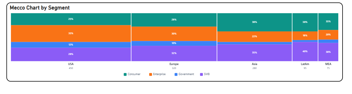
The Briqlab Mekko Chart is an interactive visualization used to display two-dimensional proportional data across categories and subcategories simultaneously. Each column represents a primary category, with its width corresponding to its share of the total value, while the height of each segment within the column represents the proportional breakdown of subcategories, making it easy to compare both category size and internal composition at a glance. The chart supports dual-axis proportional encoding, allowing users to simultaneously analyse the relative weight of each primary category and the distribution of subcategories within it. This enables a more comprehensive understanding of how different segments contribute to both their parent category and the overall dataset. It features automatic colour assignment for clear subcategory differentiation across all columns and supports labelled segments for improved readability of both values and percentages. The visual also includes interactive tooltips and hover highlights, allowing users to easily explore individual segment details and compare proportional contributions across different categories and subcategories. With its two-dimensional and data-rich design, the Briqlab Mekko Chart is effective for market analysis, portfolio breakdown, competitive benchmarking, and compositional comparisons, making it an ideal tool for datasets that require simultaneous evaluation of both category size and internal distribution within a single unified view.
briqlab-mekko-chart
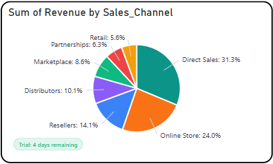
The Briqlab Pie Chart is an interactive visualization used to display the proportional distribution of data across a set of categories. Each segment of the pie represents a distinct category, with its size corresponding to its contribution to the total value, making it easy to compare the relative share of each component within the whole dataset at a glance. The chart supports interactive segment highlighting, allowing users to hover or click on individual slices to view detailed value and percentage information for each category. This enables a more focused understanding of how individual components contribute to the overall distribution and total. It features automatic colour assignment for clear category differentiation and supports outside labels with connector lines for improved readability across both large and small segments. The visual also includes smooth rendering animations and a configurable legend, allowing users to easily identify and distinguish between categories within the dataset. With its simple yet effective circular design, the Briqlab Pie Chart is effective for analyzing part-to-whole relationships, comparing category shares, and communicating proportional data, making it an ideal tool for dashboards that require a clear and concise representation of distribution across multiple categories.
briqlab-drill-down-pie
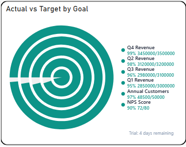
The Briqlab Progress Ring is an interactive visualization used to display the completion status and achievement level of a metric or goal in a circular ring format. Each ring represents a distinct KPI or target, with its filled arc length corresponding to the percentage of progress achieved, making it easy to understand how close a value is to its defined goal at a glance. The visual supports multiple concentric or individual ring displays, allowing users to monitor several metrics simultaneously within a compact and visually balanced layout. This enables a more intuitive understanding of progress across different categories and how each one compares in terms of goal attainment. It features automatic colour coding for clear differentiation between completed, in-progress, and underperforming metrics, and supports centre labels displaying the actual value or percentage for improved readability. The visual also includes smooth fill animations and configurable threshold indicators, allowing users to easily identify which metrics are nearing completion and which require immediate attention. With its clean and space-efficient circular design, the Briqlab Progress Ring is effective for goal tracking, performance monitoring, and completion analysis, making it an ideal tool for dashboards that require a visually engaging and straightforward representation of progress towards defined targets.
briqlab-progress-ring
The Briqlab KPI Pulse is an interactive visualization used to display the real-time status and performance of key performance indicators in a compact and focused format. Each KPI card represents a distinct metric, with its value, trend, and status displayed together, making it easy to monitor critical business measures and their progress at a glance. The visual supports dynamic status indicators, allowing users to instantly identify whether a KPI is performing above, below, or on target through colour-coded signals and directional trend arrows. This enables a more immediate understanding of overall business health and where attention is required across different performance areas. It features automatic colour coding for clear status differentiation between positive, neutral, and negative performance states, and supports customizable labels and target values for improved contextual readability. The visual also includes pulse-style animations and trend sparklines, allowing users to observe recent movement patterns and momentum shifts across individual KPIs at a glance. With its concise and dashboard-friendly design, the Briqlab KPI Pulse is effective for executive reporting, performance monitoring, and real-time tracking, making it an ideal tool for dashboards that require a quick and clear overview of multiple business metrics within a single unified display.
briqlab-kpi-pulse
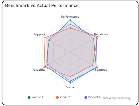
The Briqlab Radar Pro Chart is an interactive visualization used to display multivariate data across multiple dimensions or categories in a circular layout. Each axis represents a distinct metric or attribute, with its length corresponding to the value achieved in that dimension, making it easy to compare performance profiles across multiple variables at a glance. The chart supports multi-series overlays, allowing users to plot and compare several categories or entities simultaneously on the same radar grid. This enables a more comprehensive understanding of how different groups perform across shared dimensions and where strengths or weaknesses are concentrated. It features automatic colour assignment with transparent fill areas for clear series differentiation and supports labelled axis endpoints for improved readability. The visual also includes configurable gridlines and polygon overlays, allowing users to easily identify performance gaps, balanced profiles, and outlying dimensions across different categories. With its circular and symmetrical design, the Radar Pro Chart is effective for performance benchmarking, skill assessment, competitive analysis, and identifying patterns across multiple attributes, making it an ideal tool for datasets that require simultaneous evaluation of several metrics within a single view.
briqlab-radar-pro
The Briqlab Text Scroller is an interactive visualization used to display a continuous stream of text-based data or marquee-style information across the screen. Each text entry represents a key metric, message, or data point, with its content scrolling smoothly across the display, making it easy to present multiple updates or highlights in a compact and dynamic format. The visual supports continuous horizontal or vertical scrolling, allowing users to cycle through multiple data points or announcements in a seamless loop. This enables a more engaging and space-efficient way of presenting key information without overwhelming the viewer with static content. It features customizable text size, colour, and speed settings for clear content differentiation and improved readability. The visual also includes smooth animation and configurable scrolling direction, allowing users to tailor the display to suit different dashboard layouts and presentation requirements. With its dynamic and attention-grabbing design, the Briqlab Text Scroller is effective for displaying live updates, ticker-style announcements, KPI highlights, and marquee messages, making it an ideal tool for dashboards that require continuous and rotating information delivery.
briqlab-scroller
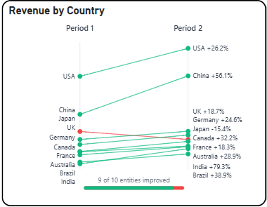
The Briqlab Slope Chart is an interactive visualization used to display the change in values between two or more time periods or categories. Each line represents a category or entity, with its slope corresponding to the direction and magnitude of change, making it easy to compare how different items have increased, decreased, or remained stable over time. The chart highlights the relationship between starting and ending values through connected data points, allowing users to instantly identify trends, reversals, and relative shifts across categories. This enables a more focused understanding of how individual items have progressed or declined between defined comparison points. It features automatic colour assignment for clear category differentiation and supports labelled endpoints on both sides for improved readability. The visual also includes positive and negative slope indicators, allowing users to easily distinguish between growth and decline across different categories at a glance. With its clean and focused design, the Slope Chart is effective for comparing performance shifts, ranking changes, and directional trends, making it an ideal tool for identifying winners, losers, and key movers within a dataset.
briqlab-slope-chart
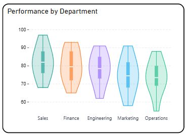
The Briqlab Violin Plot is an interactive visualization used to display the distribution and probability density of data across categories or groups. Each violin shape represents a category, with its width at any given point corresponding to the frequency of values in that range, making it easy to compare distributional patterns across multiple groups at a glance. The chart combines the features of a box plot and a density plot, allowing users to simultaneously view the spread, median, interquartile range, and overall shape of the data distribution. This enables a more comprehensive understanding of how values are concentrated or spread within each category. It features automatic colour assignment for clear group differentiation and supports symmetric density mirroring on both sides of the axis for improved readability. The visual also includes key statistical markers such as median lines and quartile ranges, allowing users to easily identify central tendencies and variability across different categories. With its rich statistical design and intuitive shape-based encoding, the Violin Plot is effective for comparing distributions, detecting skewness or outliers, and understanding the underlying patterns within a dataset.
briqlab-violin-plot
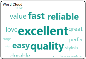
The Briqlab Word Cloud is an interactive visualization used to display the frequency or importance of words within a dataset. Each word represents a category or term, with its size corresponding to its relative value or occurrence, making it easy to identify the most prominent and least prominent terms at a glance. The chart supports dynamic sizing, where higher-value words appear larger and bolder while lower-value words appear smaller, allowing users to quickly spot dominant themes or keywords within the data. This enables a more intuitive understanding of how individual terms contribute to the overall distribution. It features automatic colour assignment for clear word differentiation and supports flexible layout arrangements for improved readability. The visual also includes smooth rendering and responsive design, allowing users to easily interpret patterns across different levels of data importance. With its visually engaging design and data-driven layout, the Word Cloud is effective for analyzing text-based or categorical data and identifying key contributors and trends within a dataset.
briqlab-word-cloud
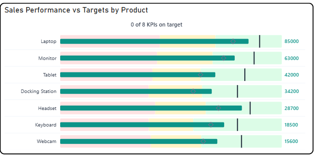
The Briqlab Bullet Pro Chart is an interactive visualization used to display actual sales performance relative to predefined thresholds and targets across multiple categories. Each bar represents a product or category, with its length corresponding to the actual value achieved, making it easy to compare performance at a glance. The chart features a multi-zone background system, dividing each row into Poor, Satisfactory, and Good performance bands, allowing users to instantly understand where actual performance falls within the acceptable range. A vertical target marker line is overlaid on each bar to indicate the goal value, providing a clear visual reference for success. It supports outside value labels for precise data readability and uses distinct colour coding for each performance zone to enable quick identification of underperforming or overperforming categories. The visual also includes a KPI summary indicator at the top, showing how many categories are meeting their targets at a glance. With its structured layout and performance-zone design, the Bullet Pro Chart is effective for tracking goal attainment, benchmarking performance, and identifying categories that require attention within a dataset.
briqlab-bullet-pro
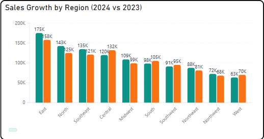
Briqlab Bar chart is designed to provide clear and flexible data visualization with a modern user experience. It supports both vertical and horizontal orientations , allowing users to switch views easily through the format pane. Users can click on any bar to drill down into subcategories , enabling deeper analysis using the available data hierarchy. The visual also supports cross-filtering , meaning selections automatically update and interact with other visuals on the Power BI report page. The design includes rounded bar corners and a modern visual style , enhancing readability and aesthetics. Optional data labels with K/M formatting provide quick insights into values without cluttering the chart. Additionally, a rich hover tooltip displays detailed information for each data point, and a smooth grow-from-bottom animation improves the visual experience when the chart loads.
briqlab-bar-chart