Published by Rasiga
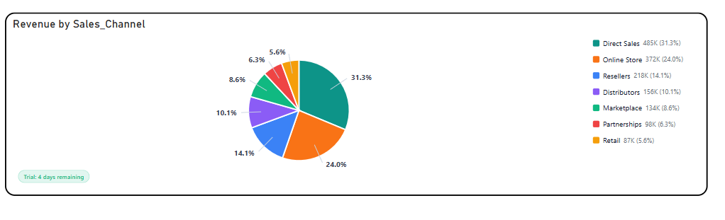
Briqlab Pie Chart is an interactive visualization designed to represent part-to-whole relationships by displaying the proportional contribution of categories within a dataset through segmented slices. Each slice is sized according to its value and color-coded for clear category differentiation, enabling users to quickly compare shares, identify dominant contributors, and analyze distribution patterns at a glance.
The visual supports intuitive proportional analysis with configurable labels, legends, and percentage/value display options, making it easy to interpret both relative and absolute contributions. Interactive tooltips and category highlighting allow users to explore detailed values and gain deeper insight into category composition.
With its clean and engaging design, Briqlab Pie Chart is ideal for revenue distribution, market share analysis, composition breakdowns, category comparisons, and dashboards requiring a simple yet effective view of how individual segments contribute to the whole.